ydney’s modern homes—whether minimalist new builds, contemporary renovations or sleek townhouses—deserve an exterior palette that reflects both their clean architecture and the unique coastal climate. The exterior colour scheme you choose does more than just enhance curb appeal; it creates a mood, complements surrounding landscape, and increases property value.
From warm neutrals to bold contrasts, thoughtful combinations can accentuate rooflines, highlight textures, and make modern architecture feel inviting and timeless. In this guide, we explore exterior colour pairings that work beautifully across Sydney’s suburbs, with expert insight to help you plan your next paint project.
Why Colour Combination Matters for Modern Homes
A modern exterior often features simple lines, open façades, and a mix of textures—such as timber, metal, render or masonry. Colour becomes the visual glue that harmonises these elements, delivering cohesion rather than contrast.
Well-balanced pairings can:
- Frame architecture and enhance proportions
- Balance light reflection and depth
- Blend built forms with garden and surrounds
- Make bold design decisions feel intentional and elegant
In contrast, mismatched tones, too many hues, or overpowering contrast can create visual confusion on modern designs that rely on clarity.
Popular and Effective Colour Pairings
1. Charcoal and Stone with Warm Neutrals
Stone or light grey render paired with charcoal trim and warm beige accents gives a fresh, grounded feel. The warmth of the neutral adds softness to the crisp grey foundation, while charcoal doors and fascia underscore architectural symmetry.
This combination suits towns like Surry Hills, Balmain, and inner west villages where sun-bleached materials meet sharp modern lines.
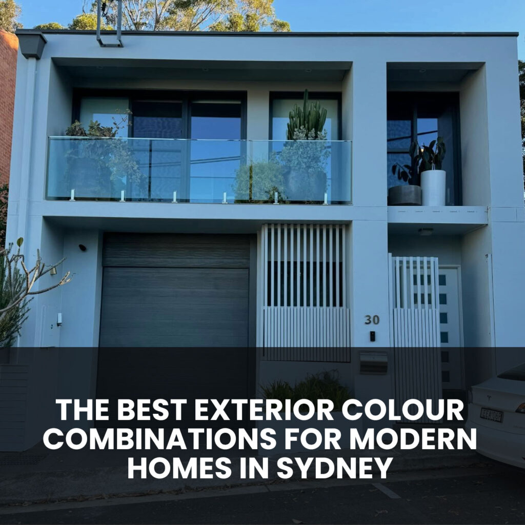
2. Off-White and Slate With Black Accents
A crisp, off-white façade (think soft magnolia or ivory) combined with slate-coloured trim and matte black highlights is striking. Window frames, gutters, and front doors in deep black or graphite give visual weight, while the lighter walls make spaces feel open.
This is ideal for coastal properties or those that face east or north, where sunlight highlights clean forms.
3. Muted Teal, Greige Render and Smoked Oak
For a more individualistic palette, try greige (grey-beige) on main walls, muted teal on trims and window reveal recesses, and smoked oak-stained timber on porch posts or screening. This blend offers calm yet unexpected colour without overpowering the architecture.
Perfect for suburbs like Mosman or Paddington, where dwellings merge structure with greenery.
4. Warm Taupe, Matte Charcoal and Terracotta Accents
Warm taupe or biscuit-coloured walls combined with matte charcoal trims and guttering, plus terracotta on door frames or garage doors, creates warmth under Sydney’s harsh sun. The terracotta brings a touch of terra-cotta roof tile heritage; the charcoal anchors symmetry.
Ideal for inner-city townhouses or new developments in Eastern suburbs demand subtle town warmth.
5. Steel Blue and Soft White with Deep Anthracite
Steel blue exteriors with soft white trim lend a coastal-modern aesthetic. When paired with deep anthracite shutters, downpipes, or front door, the effect is both soothing and dynamic. This palette reflects harbourside living while retaining crisp modernity.
This scheme works well in waterfront locations from Rozelle to Manly.
How to Pick the Right Palette for Your Home
Examine the Architectural Materials
Take stock of your roof colour, window frame colour, brick tone or stone cladding, and any timber or concrete features. These are your starting points. Aim to choose at least one dominating wall colour, one trim or door accent hue, and optionally a third supporting shade.
Test Colours at Different Times of Day
Colour looks different under morning light, mid-day sun, cloudy sky, or late afternoon glow. Paint swatches should be applied to a piece of board hung on the main façade; observe it when approaching from different angles.
Use Undertone Awareness
If your roof or stone carries warm undertones, pair with warm wall tones. Cool roof tiles complement cool greys or muted blues. Avoid mixing warm and cool in a way that creates visual friction.
Apply the 60-30-10 Principle
- 60% — Main wall colour (soft, neutral base)
- 30% — Secondary surfaces (trim, window frames, fascia)
- 10% — Accent features (door, balcony glass frame, decorative slats)
This ratio ensures balance without overcrowding your design with multiple competing colours.
Colour Inspiration Based on Modern Home Styles
Minimalist Cube or Rendered Cube Design
Choose neutral pale grey or off-white walls, charcoal or dark-toned trims, and matte black accents. Doors and letterboxes in graphite give strong punctuation. Timber screens or screens soften the aesthetic.
Urban Terrace Modernisation
Combine two-tone render: darker greys on lower walls, lighter greys above. Use streamlined black metal or powder-coated window frames. Contrasting front door colour—such as deep blue, rust-red or charcoal—draws attention.
Weatherboard Revival with Modern Touch
Paint weatherboards in warm neutral tones (light taupe or ecru), pair with crisp white trim and deep charcoal fascia. Doors and shutters in matt black or navy tie everything together cleanly.
Common Mistakes to Avoid
- Too many colours: Keeping design minimal avoids visual complexity.
- Poor coordination with roof or materials: Swatches must complement—not compete.
- Inconsistent finishes: All trims, gutters and doors should match in sheen and tone for a polished look.
- Insufficient testing: Colour can drastically shift from indoor lighting to outdoor conditions.
- Ignoring sunlight or climate: South-facing walls can look flat under cool light; north-facing walls may overheat or fade warm tones.
Choosing the Finish and Paint Type
The sheen level matters as much as the colour. A modern home benefits from:
- Low sheen or satin finish on walls—subtle depth and soft highlights
- Semi-gloss or gloss finish on doors and trim—for durability and clean edges
- UV-resistant, exterior-grade coatings suited for coastal or high-heat regions
- Mould-resistant paint in shaded or damp façade areas
AKD Painting selects products tailored to your roof, wall material and exposure to ensure longevity and performance.
Why Professional Execution Is Key
A colour palette is only as good as its application. For modern homes, professional surface preparation, crisp cutting-in, and consistent coverage across textured surfaces are essential. At AKD Painting, we deliver:
- High-definition lines with fine brushes or masking tools
- Seamless paint transitions between textures
- Uniform coats without lap lines or spray inconsistencies
- Weather-timed scheduling to avoid overspray, runoff or premature peeling
Ready to Transform Your Exterior?
If you’re planning to refresh your modern façade or re-enliven your street appeal, AKD Painting can help you select the ideal colour combination and deliver a flawless finish.
Call AKD Painting on 0474 854 369 to arrange a colour consultation, or detailed quote. Together, we’ll create a sleek, modern exterior that feels timeless.