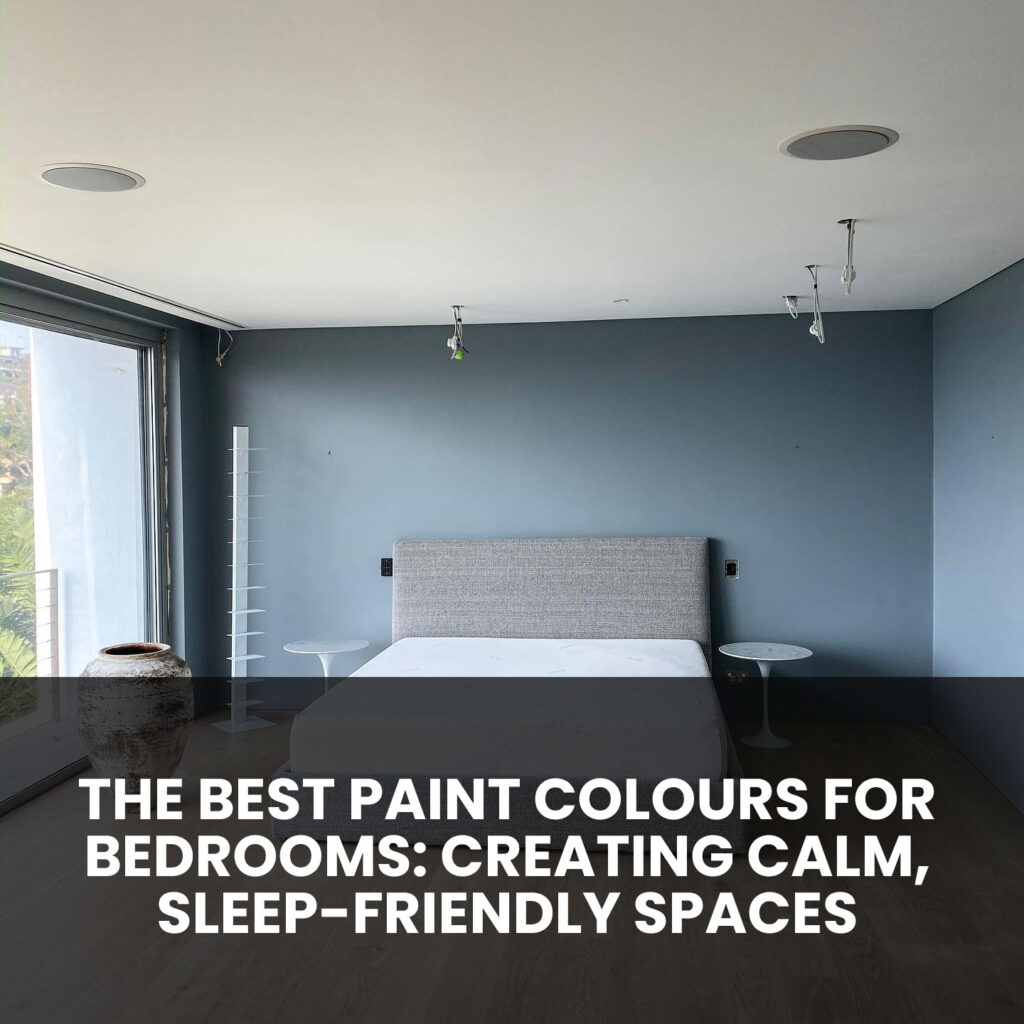
Your bedroom should be a sanctuary. It’s the place where you begin and end each day—a private space for rest, relaxation, and recovery. While furniture, bedding and lighting all play their roles, the colour on your bedroom walls forms the foundation of the room’s mood. Choosing the right paint colour can dramatically affect how calm, balanced and comfortable your bedroom feels.
The psychology of colour is well-documented. Cool, muted tones tend to promote relaxation and quiet the mind, while bright or saturated shades can be energising and mentally stimulating. That’s why selecting a calming, sleep-friendly paint colour for your bedroom is one of the most important design decisions you can make.
At AKD Painting, we’ve helped countless Sydney homeowners transform their bedrooms with beautifully selected and professionally applied paint. Here, we’ll explore the best colours for creating tranquil bedrooms and provide practical insights to help you choose a shade that not only looks beautiful but also helps you sleep better.
Understanding the Role of Colour in a Bedroom
Colour doesn’t just affect aesthetics—it has a direct impact on how we feel. Certain colours can:
- Lower or elevate your heart rate
- Influence hormone levels and alertness
- Set the emotional tone of the space
- Help the brain associate a room with relaxation or stimulation
In bedrooms, colour should support winding down. It should help your body and mind ease into sleep and promote a feeling of calm when you wake. For this reason, most bedroom colour palettes lean toward soft, cool hues, earth tones, and muted neutrals.
Top Bedroom Paint Colours for Calm and Comfort
1. Soft Blues

Blue is one of the most popular bedroom colours—and for good reason. Blue evokes feelings of serenity, order, and clarity. Lighter shades such as powder blue, duck egg, and misty sky are ideal for bedrooms because they create an airy, gentle environment.
Blue has also been linked to reduced heart rate and lower blood pressure, making it an ideal colour for winding down at the end of the day. For best results, choose blue tones with grey or green undertones to avoid a stark, cold feeling.
Popular blue shades for bedrooms include:
- Pale coastal blue
- Grey-blue
- Dusty cornflower
- Blue-green blends
2. Muted Greens

Green represents nature, renewal and balance. It brings a sense of freshness while remaining grounded. Soft sage, mint, olive and eucalyptus-inspired greens are becoming increasingly popular in Australian homes, especially where biophilic or nature-inspired design is embraced.
Because green sits between warm and cool on the colour spectrum, it brings a soothing neutrality that works in all types of light and room sizes. It’s also versatile, pairing beautifully with timber, stone, white trims, or natural textiles.
Calming green tones to consider:
- Soft sage green
- Light moss
- Pistachio or mint
- Pale olive
3. Earthy Neutrals

For homeowners who prefer a warm, comforting palette, neutral earth tones are an excellent choice. Beige, soft taupe, warm grey and greige (a blend of grey and beige) provide a clean and modern base without being stark or sterile.
These colours bring warmth without overwhelming the senses. They also work well with most furniture styles, allowing you to layer in textures through linen, timber, rattan or leather.
Recommended earthy neutrals:
- Light clay or stone
- Warm beige with pink undertones
- Soft mushroom grey
- Natural taupe
4. Pale Lavenders and Dusty Pinks
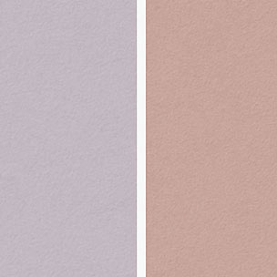
Light purples and pinks can work beautifully in bedrooms when used with restraint. Lavender, lilac, mauve and blush pinks can create a romantic and peaceful atmosphere.
It’s best to avoid bright, saturated versions of these colours. Instead, look for dusty or greyed-out tones that feel subtle and mature. These colours are especially well-suited to bedrooms with soft natural light or classic architectural details.
Soothing options include:
- Muted lavender-grey
- Blush or rose quartz
- Soft plum or mauve
- Smoky lilac
5. Warm Whites and Off-Whites

For a clean, minimalist bedroom that still feels inviting, warm whites are a timeless option. While bright, cool whites can feel clinical, warm whites add softness and dimension without drawing too much attention.
White-based rooms also provide a flexible foundation if you like to change bedding or artwork seasonally. Just make sure to test your white in natural and artificial light—it can look different in the morning than it does in the evening.
Examples of popular off-white tones:
- Creamy white
- Soft ivory
- Warm antique white
- White with peach or beige undertones
6. Soft Greys

Cool greys offer a sleek, contemporary look and work especially well in modern homes. Lighter shades can make small rooms feel larger, while deeper greys can add mood and sophistication in larger spaces.
Grey is also extremely versatile—it pairs well with blush, navy, mustard, or timber. Choose greys with warm undertones for a more restful effect, especially in bedrooms that don’t receive a lot of natural light.
Favourite grey bedroom tones:
- Dove grey
- Greige (grey-beige blend)
- Misty charcoal
- Warm silver
Colours to Use with Caution in Bedrooms
While there’s room for personal preference, certain colours may be too energising or distracting for bedrooms, including:
- Bright reds – Associated with energy, passion and even aggression. These colours may increase alertness rather than promote rest.
- Vibrant yellows – While cheerful, bright yellows can be overstimulating when used on all walls.
- Bold oranges – Typically suited to active spaces like living rooms or kitchens.
- Intense purples or dark blues – Can be overwhelming unless balanced with plenty of light and neutral furnishings.
That said, darker or richer tones can be used effectively as accent walls or in combination with soft furnishings, trims and warm lighting. It’s all about balance.
Tips for Choosing the Right Colour for Your Bedroom
- Test in natural light: Always sample colours on the wall and observe them at different times of day. Paint can look very different under morning sun versus evening lamp light.
- Consider the room’s direction: North-facing rooms benefit from warmer tones, while south-facing rooms with plenty of light can handle cooler shades.
- Match your mood and style: Are you going for a soft, romantic retreat? A crisp, modern sanctuary? A restful, natural vibe? Let that guide your palette.
- Layer with complementary furnishings: Once your wall colour is chosen, layer in textures through bedding, window treatments, rugs and art for added warmth and character.
- Don’t overdo it: Stick to one or two main colours in your bedroom. Too many competing tones can feel chaotic rather than restful.
Why Professional Application Makes a Difference
Even the most beautiful colour will fall flat if it’s not applied properly. Uneven coats, poor cutting-in, or patchy finishes can ruin the atmosphere you’re trying to create.
At AKD Painting, we ensure your chosen bedroom colour is applied smoothly, cleanly and with the highest attention to detail. From surface preparation and priming to final touch-ups, we take pride in every step.
We also offer advice on paint sheen—whether a flat matte for softness or a low-sheen for better durability—and ensure your finish complements the chosen colour.
Ready to Transform Your Bedroom into a Tranquil Escape?
Whether you’re repainting a master bedroom, a guest room or a new nursery, selecting the right colour can make all the difference in how you rest and relax. At AKD Painting, we offer colour consultations, expert guidance and premium painting services to help you bring your vision to life.
Call AKD Painting today on 0474 854 369 to discuss your bedroom painting project. We’ll help you choose a palette that calms the mind, softens the space and gives you a room you’ll love waking up in—and falling asleep to.