
By Alex Dzissah, Founder, AKD Painting
Choosing the right exterior paint colour is about more than just enhancing curb appeal. It’s about creating harmony between your home’s existing elements. The roof, brickwork, stone cladding, and architectural features form the foundation of your design palette. Selecting external paint colours that blend naturally with these core assets ensures your home looks cohesive, well-planned, and visually striking.
Whether you have a traditional brick façade, a modern tiled roof, or Queenslander-style weatherboards set atop stone features, thoughtful colour selection can tie everything together. This post guides you through strategies, visual considerations and practical steps to help you pick exterior colours that complement your roof, brick or stone with confidence.
Understanding Your Architectural Base
Evaluating Roof Materials & Colours
Your roof colour often sets the first impression. Tiled roofs range from terracotta reds and earthy browns to slate-style greys and charcoal tones. Metal roofs might be corrugated galvanised steel, zincalume or modern powder-coated finishes. Assess:
- Is your roof warm-toned or cool-toned?
- Does it have strong colour saturation or subtle neutral tones?
- Are there highlights from weathering or sun exposure?
These cues help determine complementary paint hues: warm roofs pair beautifully with neutral taupes, soft creams, muted greens and rich terracotta trims; cooler roofs can be balanced by greys, off-whites, charcoal or slate-hued facades.
Matching Brick & Stone Undertones
Brick and stone come in a broad range from deep reds, warm beiges and golden sands to ashy greys and even soft pinks. Each material has underlying undertones (warm yellow, red, grey, purple). Identifying these is key.
- Red brick with two-tone highlights might suit a greige or warm taupe façade.
- Sandstone or golden stone looks harmonious with earthy light greens, creamy neutrals or nature-inspired blues.
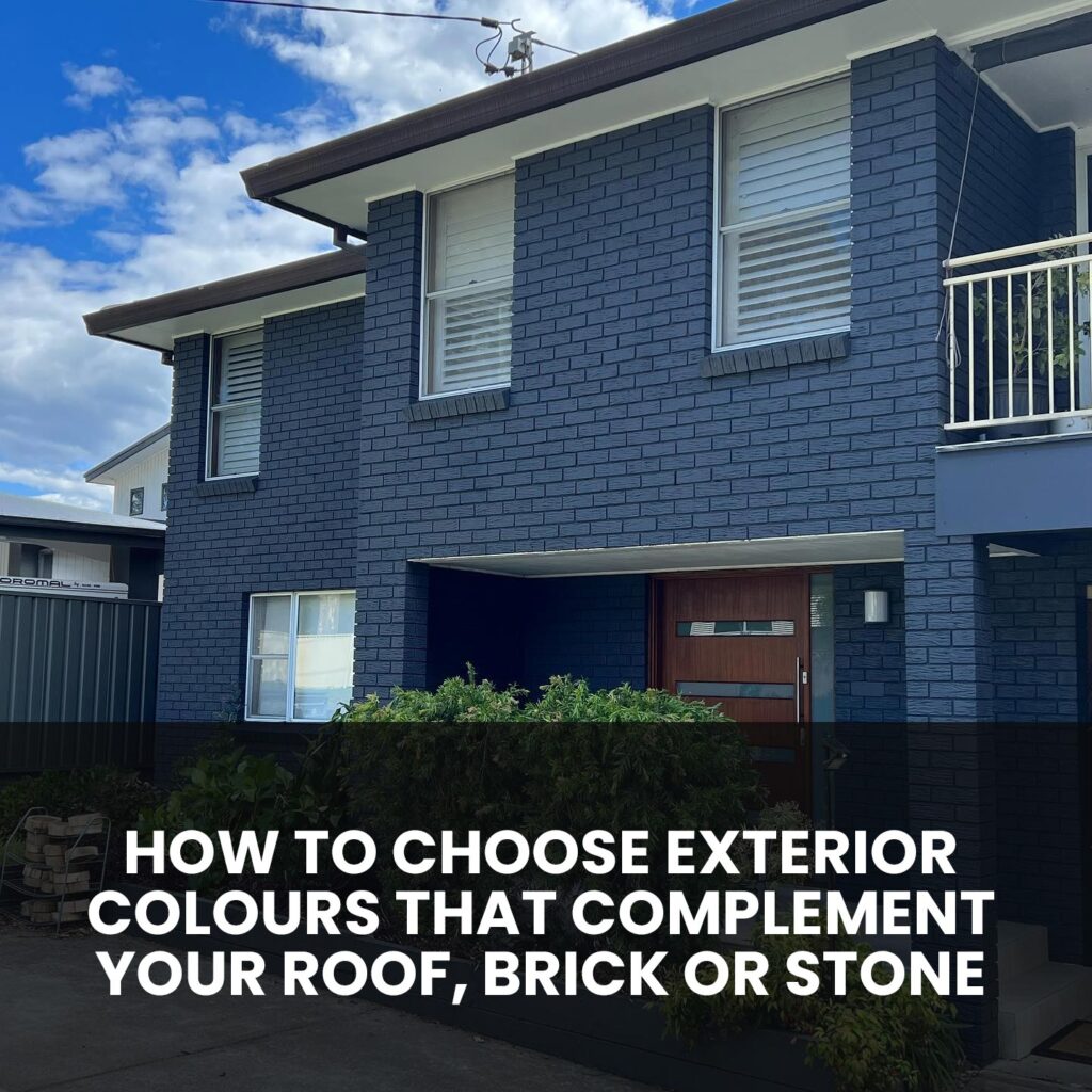
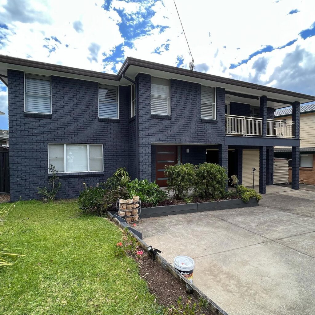
- Grey stone or bricks pair well with crisp whites, charcoal trims or pale blue-grey walls.
Undertones determine whether a neutral is warm or cool, and aligning with those tones produces a polished, balanced look.
Complementary Colour Strategies
Use the 60-30-10 Rule
This classic design rule helps guide balanced exterior palettes:
- 60% – Primary façade colour (walls)
- 30% – Secondary element (roofline trim, window surrounds, doors)
- 10% – Accent features (front door, architectural details, shutters)
For example, walls painted in a soft taupe, trim in a warmer sandstone, and a pop of deep charcoal on the front door create visual depth and complement rich roof tiles.
Undertone Matching Matters
Mixing undertones can clash. If your brick has warm red undertones, avoid cool grey paint that reads blue. Instead, choose warm neutrals such as beige, cream or taupe. If your roof is a cool charcoal, pairing it with a warm facade colour might feel disjointed.
Always hold paint swatches up to natural light near the wall and the brick or stone. Check across the day. What looks like cream in the morning may appear greenish under afternoon sun.
Contrast vs Coordination
Contrast helps define architectural lines. A light façade against dark roof and trim emphasises form. Coordination softens transitions with subtle variations in tone that appear cohesive.
For a natural look on a sandstone façade, choose a wall colour just one or two tones lighter or darker than the stone. For contemporary impact, select crisp white or charcoal walls to contrast with neutral slate roofs.
Practical Steps to Colour Selection
1. Collect Original Material Samples
Take photos or bring samples of your roof, brick or stone into your colour consultation. Exact photos under natural daylight help us match undertones and saturation.
2. Create a Palette of Three Colours
Start with a base that complements the roof or masonry, then test trim variations and a bold accent. This lets you view the full scheme in context.
3. Test at Scale
Use small test patches. Apply paint near your façade in different locations. Observe at dawn, sunlight and dusk. Textured surfaces like stone reflect light differently than a smooth painted wall.
4. Consider Age and Weathering
Materials fade and weather over time. Fresh white paint may look stark against slightly weathered clay tiles. Opting for soft colours that already relate to faded tones helps maintain harmony long term.
5. Examine Light Reflection
In low light, pale colours may appear dull or chalky; in bright sunlight, warm tones may look muted against dark tile shadows. Swap paint swatches while holding a mirror to simulate varying light directions.
Colour Pairing Inspiration Based on Material Types
Warm Red or Terracotta Roof Tiles & Brickwork
Pairs well with warm neutrals: sandy taupe, oatmeal beige, muted greens with yellow undertones and accent features in deep chocolate or olive. Avoid stark whites that may clash with warm tones.
Chalky or Grey-Brown Roof Tiles
These tones open up options like pale greys, soft sage greens, graphite trims and crisp off-whites. Add depth with navy or slate-blue front doors.
Bluestone or Grey Brickwork
Bluestone facades look beautiful with magnolia creams, greige, soft charcoal trims or gentle bluish greys. Bronze fixtures, matte black gutters and charcoal trim bring contrast and sophistication.
Golden Stone or Sandstone
Earthy, nature-themed palettes work well: warm greens, soft terracotta, muted peach, or pale sand shades. Midnight blue doors or clay-red accents add dramatic richness.
Additional Exterior Features to Coordinate
Trim and Guttering
Trim colour defines edges: roof lines, windows, soffits. Popular approaches include monochromatic schemes (trim one tone darker or lighter than walls) or crisp contrast (white trim with coloured façade).
Doors and Shutters
Use your accent colour here: deep blue, forest green, terracotta, charcoal or even rich red can highlight entry points. Choose one accent colour and repeat it in multiple spaces for cohesion (e.g. shutters, mailbox, garage door).
Pavement and Paving Edge
Your driveway, path, or paving can impact the overall effect. A grey driveway may clash with warm exterior tones; in such cases, soften fascia colours or add soft earthy walls to balance the scene.
Landscaping and Greenery
Shrubs, flowerbeds and greenery will soften hard edges and enhance painted backgrounds. Pale facades allow foliage to “pop,” while darker trims anchor the planting visually.
Conveying Your Vision Clearly
Choosing exterior colours is a collaborative process:
- Show examples of homes or looks you admire, such as online images or local streetscapes.
- Clarify the mood you wish to create: traditional, dramatic, earthy, coastal calming, modern minimalism.
- If you have a signature roofing tile or brick, share that with us to start the matching.
- Ask for mock-ups or digital colour visualisations. These help preview options before final decisions.
Paint can be refreshed every decade or so, but roof and brick won’t change. Taking planning time now avoids costly repainting later.
Why Professional Painting Makes a Difference
The right colour is only the beginning. Achieving a flawless, weather-resistant finish requires:
- Thorough surface preparation: sanding, caulking, priming, fixing cracks.
- Proper paint selection: exterior-grade, UV-resistant, mould-inhibiting products suited to climate and substrate.
- Expert techniques: clean cutting-in lines, even roller application, careful sealing of joints and details.
- Attention to environmental conditions: applying under proper temperature and humidity, avoiding overspray or run-off.
Quality preparation and application ensure your chosen palette looks crisp, performs well and lasts under Sydney’s sun, storms and salt air.
Ready to Refresh Your Exterior Scheme?
Whether you’re updating trim colour, repainting weatherboards, or revitalising your home’s frontage entirely, we’d be happy to walk through a curated palette that enhances your roof, brick, and stone.
Call AKD Painting today on 0474 854 369 to discuss your exterior painting project. We’ll provide personalised colour advice, mock-ups, and a premium finish that ties every element of your façade together beautifully.
About the author
Alex Dzissah is the founder of AKD Painting, a fully licensed Sydney painting business operating since 2013. Alex and his team specialise in interior, exterior, residential and commercial painting across Sydney, with particular expertise in Inner West heritage, federation and terrace homes.